Brand Design
UX/UI
Overview
Finder Feed was a university project - it is a gamified dining app encouraging exploration of Melbourne’s diverse culinary scene. Users discover hidden food gems, earning badges and rewards for visiting unique restaurants. Focused on affordability and accessibility, Finder Feed makes dining an engaging cultural adventure.
Project Brief
To develop a mobile app that promotes Melbourne's diverse food scene by guiding users to underappreciated, budget-friendly restaurants, while providing a rewarding dining experience. It must use simulated AR features, audio features and use of the camera.
Key Objectives
Design a user-friendly map for easy navigation and restaurant discovery.
Implement a gamified badge and medal system to encourage repeat usage and engagement.
Build a seamless and enjoyable experience that motivates users to explore new cuisines regularly.
Problem Statement
How can we create a platform that makes it easy and engaging for Melbournians to explore diverse, affordable dining options while supporting local restaurants?
Research Goals
Identify the preferences and needs of young adults in Melbourne regarding their dining experiences.
Explore existing geolocation and dining apps to understand user expectations and standards.
Determine the effectiveness of gamification and rewards in driving engagement in young adults.
Competitor Analysis
Analysing popular apps like Yelp, Zomato, and Pokémon Go highlighted key strengths and gaps, guiding Finder Feed's approach to blend discovery and gamification. Key insights include:
Competing apps with simple navigation, like Yelp, show that quick access to restaurant info is essential, influencing Finder Feed’s map.
Gamified apps like Pokémon Go show that reward systems increase engagement, inspiring Finder Feed’s badge and medal system.
Apps like Zomato provide detailed restaurant profiles that show comprehensive information, prompting Finder Feed to include key details on each restaurant’s page.
Primary Research
Conducted surveys and field interviews with target users to identify dining preferences, price sensitivity, and interest in gamified experiences. Focused on understanding how users select dining locations and their willingness to try new cuisines.
Findings
Decision Fatigue: Users struggle with choosing dining options due to overwhelming choices.
Affordability: Price and location are top deciding factors for dining out.
Cultural Exploration: Users are interested in trying new cuisines but need guidance and encouragement.
Gamification: Majority responded positively to the idea of earning rewards for restaurant visits.
User Personas
Based on insights from user research, I developed two personas to represent Finder Feed’s target users: a young adult looking to explore diverse cuisines on a budget and a foodie seeking authentic dining experiences across cultures. Given the app’s aim to make discovering new restaurants both affordable and culturally enriching, the young explorer persona became the primary focus for the project’s ongoing development.
Design Recommedations
(Based on Research)
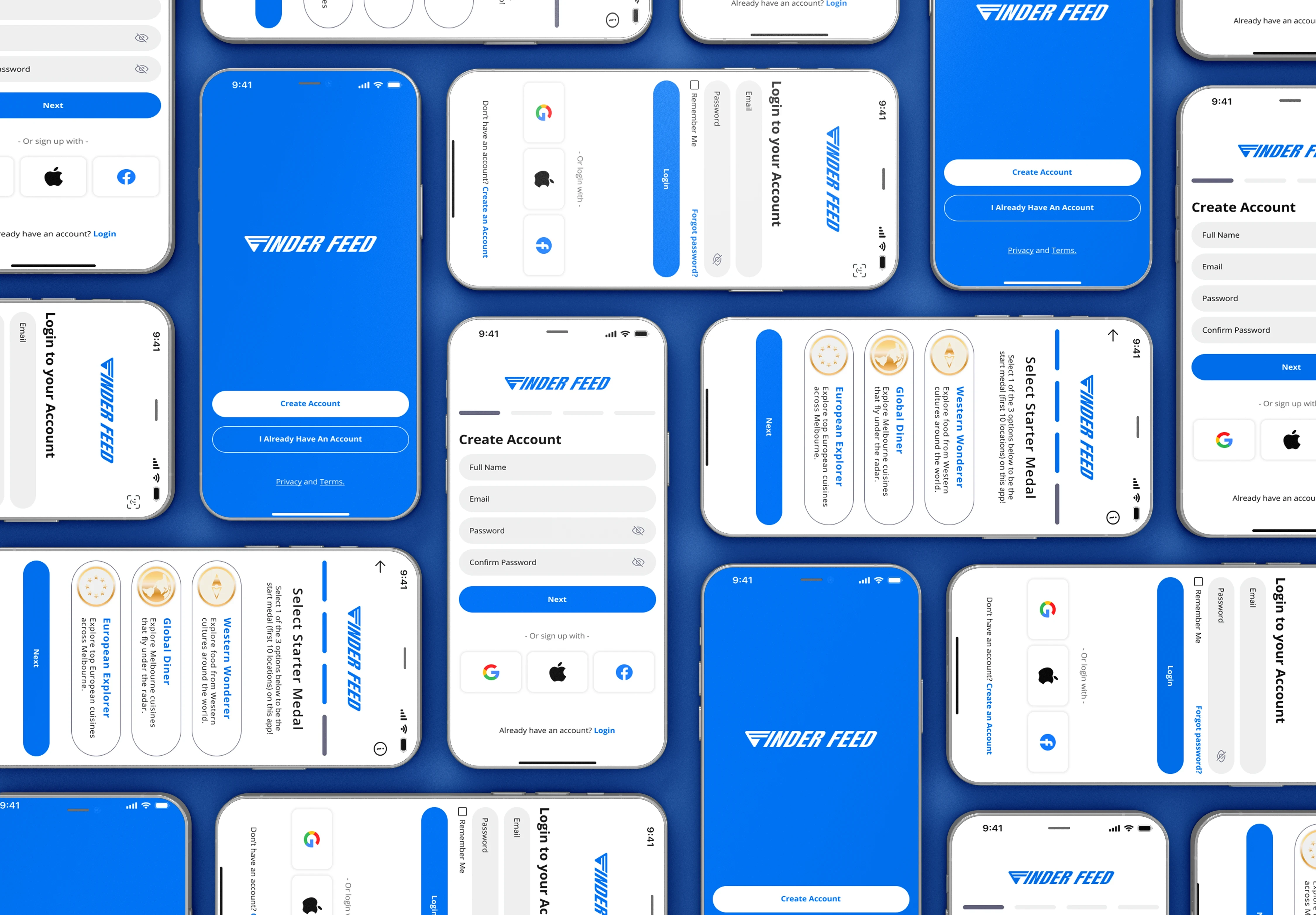
Develop a straightforward onboarding process that clearly introduces badges, medals, and vouchers, guiding users through the app’s main functions to ensure they start with a solid understanding.
Expand the restaurant pages to include essential details such as dietary filters, price range, popular dishes, and reservation requirements, enabling users to make informed dining choices.
Implement AR and audio features thoughtfully, ensuring they enhance the experience without distracting from the main goal of finding and dining at new restaurants.
Design the navigation bar for intuitive access to the main sections
UI Design & Branding
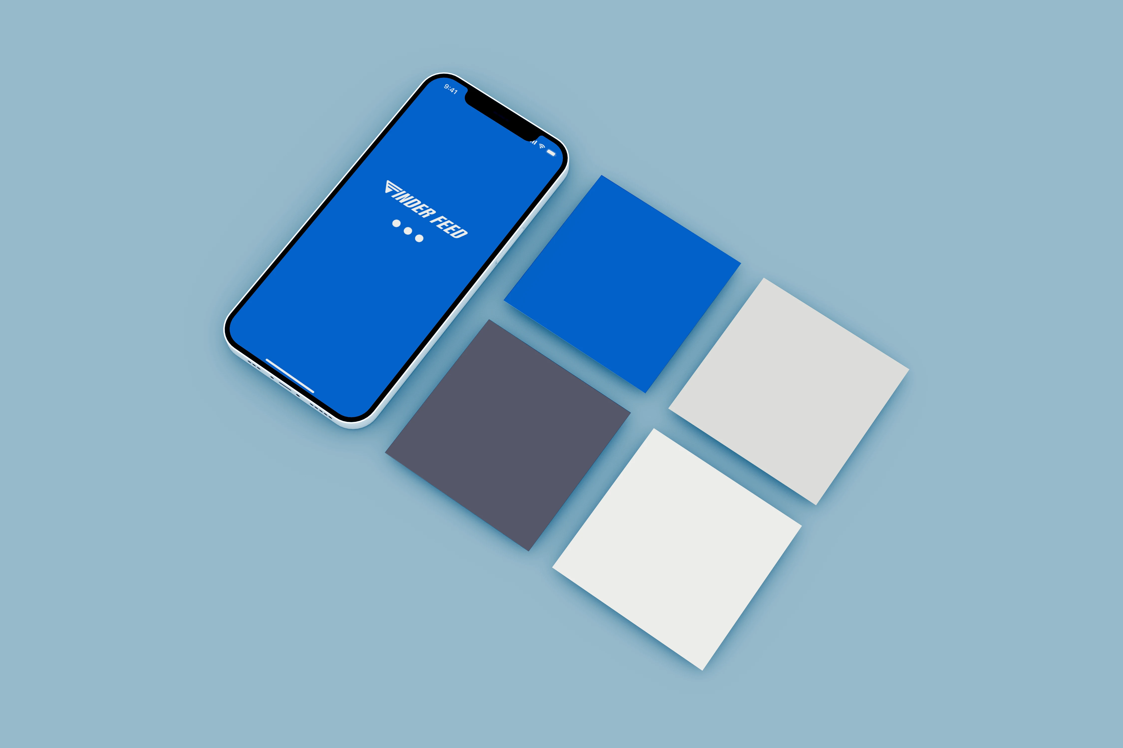
Finder Feed’s initial branding embraced a retro-futurism aesthetic, aiming to appeal to young audiences with a trendy, nostalgic look. The design features bold blues and pastels, adding vibrancy while maintaining readability. Inspired by themes of exploration, the branding also incorporates a seagull logo, symbolising the app’s purpose of guiding users to discover new dining experiences around Melbourne.
Key Screens
(Prototype 1)
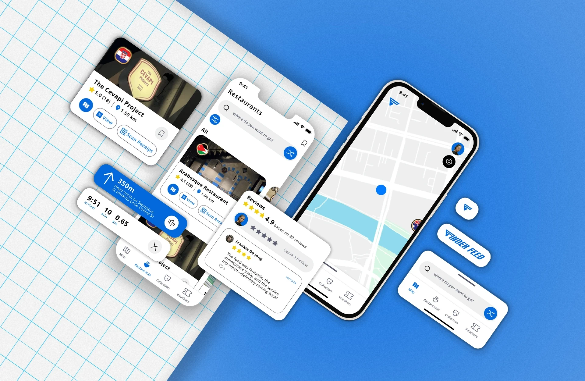
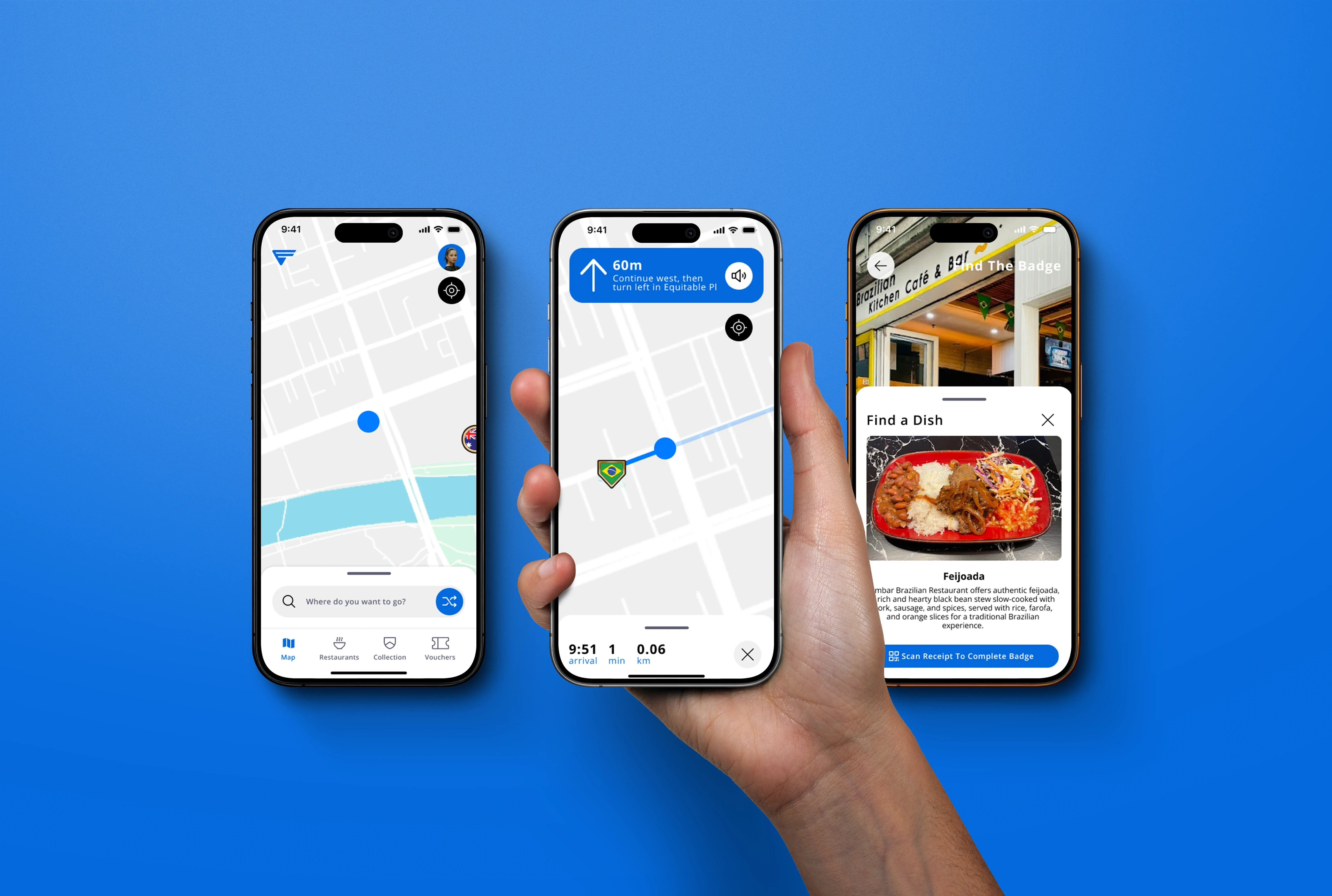
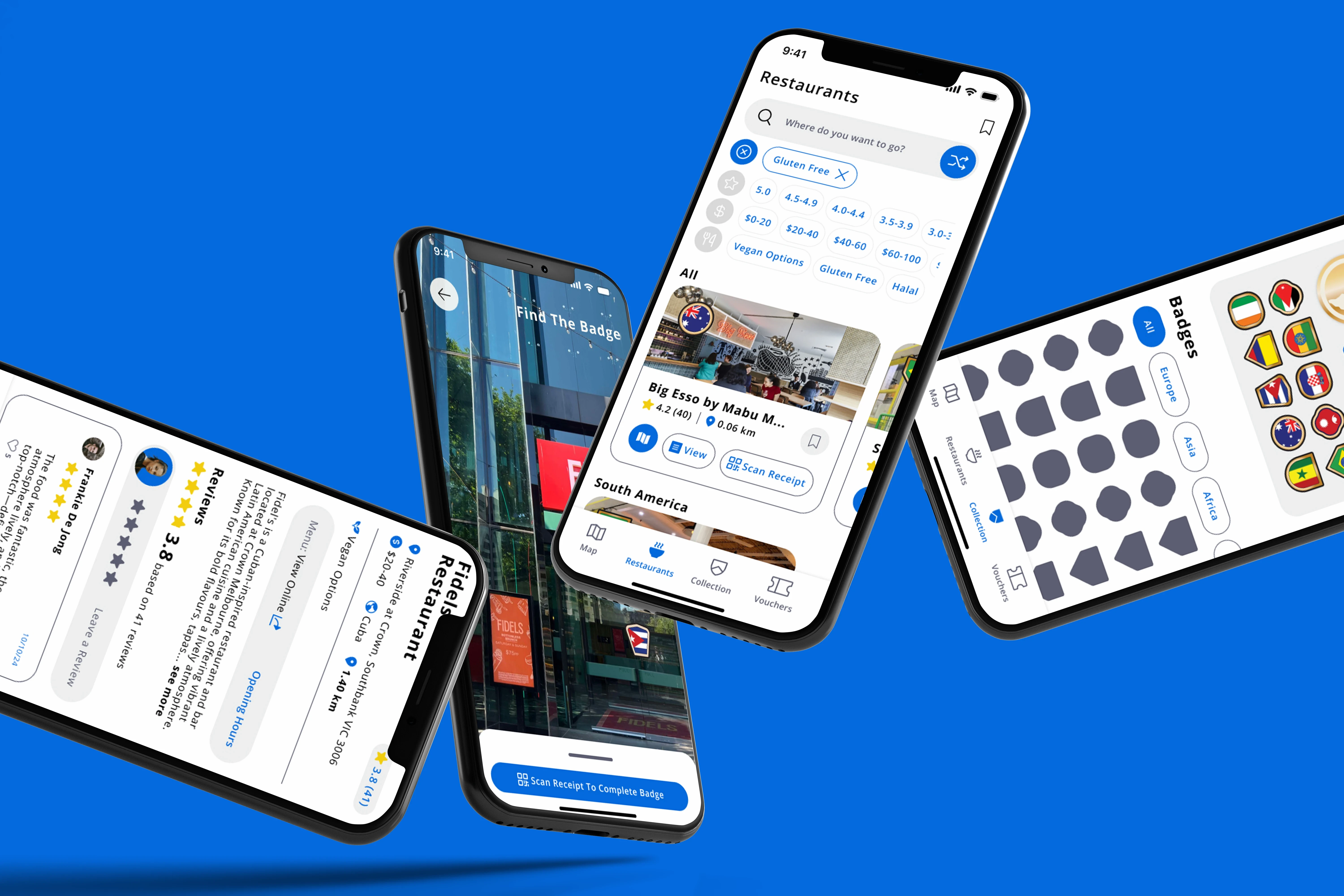
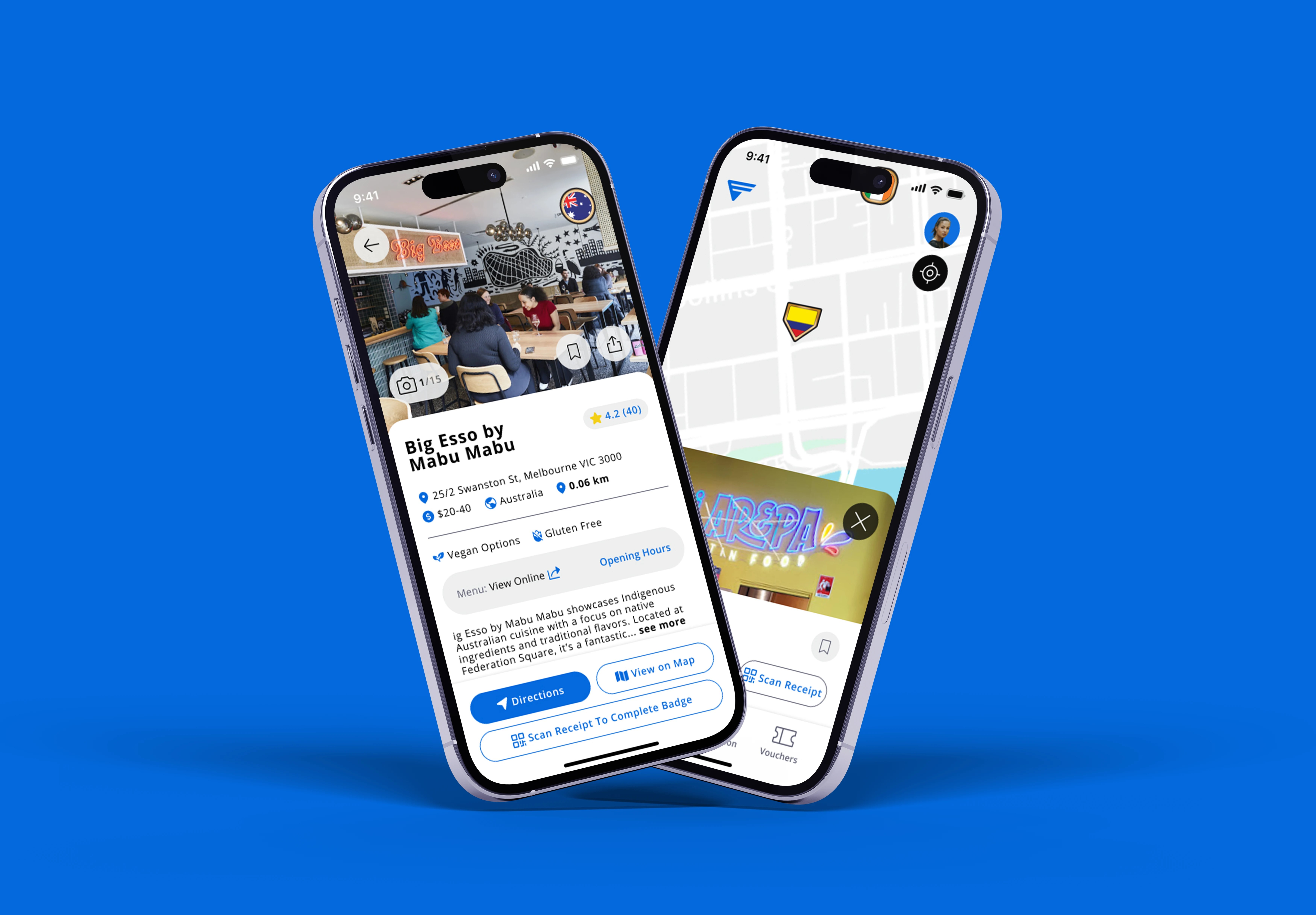
The key screens of Finder Feed’s initial prototype, including the map, badge collection, and restaurant details pages, were used in user testing to gather valuable feedback on usability and design. See below for the primary screens from Prototype 1, which served as the basis for refining the app based on user insights.
User Testing Insights
Users found map navigation challenging, leading to the addition of a Restaurant Hub.
Initial confusion around badge and voucher processes led to more detailed onboarding and in-app guidance.
Positive feedback on dietary filters, prompting inclusion of gluten-free, vegan, and halal options prominently on restaurant pages.
Design Recommedations
(Based on Testing)
Improve the onboarding process by including explanations for key features like badges, rewards, and navigation. Add visual aids or a short tutorial to explain how the app works.
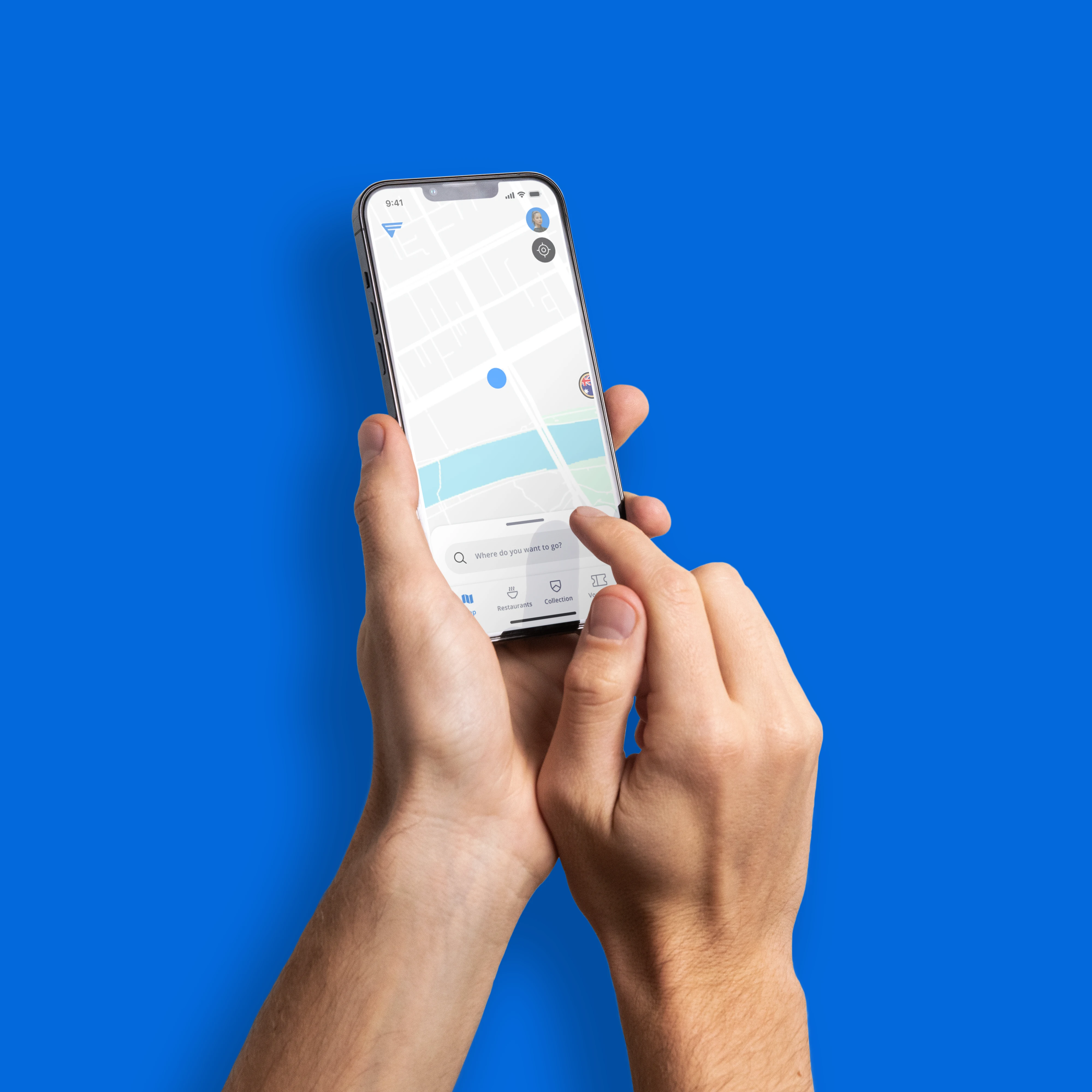
Improve the map navigation by changing scale and adding in filters for restaurants to be found easier. Include a ‘preview on map’ feature for users planning at home on restaurant pages.
Create a dedicated hub for restaurants, which lists all available restaurants, making it easier for users to navigate through their options and find new places to explore.
Simplify the badge-earning process by removing the need for both AR and QR code scanning.
Add visible dietary filters on the home screen and in the restaurant selection process (e.g., gluten-free, vegetarian).
Implement a more vibrant colour palette, and engaging graphics that align with the app s youthful, gamified experience.
Reflection
Working on Finder Feed was an eye-opener in balancing user needs with the app's broader purpose of supporting local businesses. Throughout this project, I saw firsthand how essential it is to keep the user’s journey at the forefront, especially in gamified and geolocation-based apps where engagement relies on seamless navigation and motivating rewards. Iterative feedback became a powerful tool, challenging some of my initial assumptions and guiding a more user-centered approach.
Takeaways
Prioritise early, low-fidelity prototypes to test foundational ideas and make quick adjustments.
Focus on refining navigation and interaction flows from the start to ensure smooth user experience.
Use iterative feedback effectively to stay adaptable and align designs with both user and business objectives.
Maintain a user-centred approach, especially for gamified and location-based apps where engagement is key.
